Perspective
Your business is specific. Your website should look it.
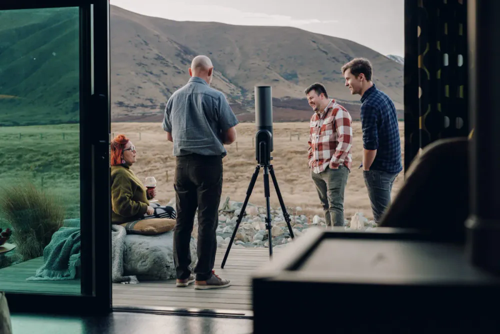
If a competitor could use every photograph on your website, the images are not showing enough of what makes your business worth choosing.
A website is often the first proper inspection of a business.
Before somebody calls, visits, books a room, requests a quote or sends a brief, they are looking for evidence. Is this place what it says it is? Do these people understand the work? Will the experience suit me? Is the product made with care? Does the business feel established enough to trust?
The photographs either help answer those questions or leave the words to do all the work.
This matters anywhere. It matters particularly across Christchurch, Canterbury and the wider South Island, where businesses with very different people, settings and capabilities are often compressed into the same small set of visual conventions: a polished headshot, a close-up of hands, an empty room and, when geography needs to be signalled, a mountain.
Those images may be attractive. They may also make a specific business look interchangeable.
The aim of website photography is not to make every page busier or more impressive. It is to make the real differences easier to see.
What customers are trying to verify
InternetNZ’s 2025 consumer and business research found that nearly three-quarters of New Zealand consumers considered a website the most important tool for engaging with a business. In the same research, 47% of surveyed businesses said they did not have one.
A website is not the only place customers form an opinion. Google Business Profiles, booking platforms, social media, referrals and physical signage all contribute. But the website is usually where a business has the most control over the complete explanation.
That makes it more than a digital brochure. It is a place where a claim can be tested.
For destination businesses, that judgement may happen before a customer commits to travelling. For industrial and trade businesses, a buyer may shortlist suppliers without ever touring the workshop, yard or production floor. In both cases, the screen has to carry evidence that would otherwise be gathered in person.
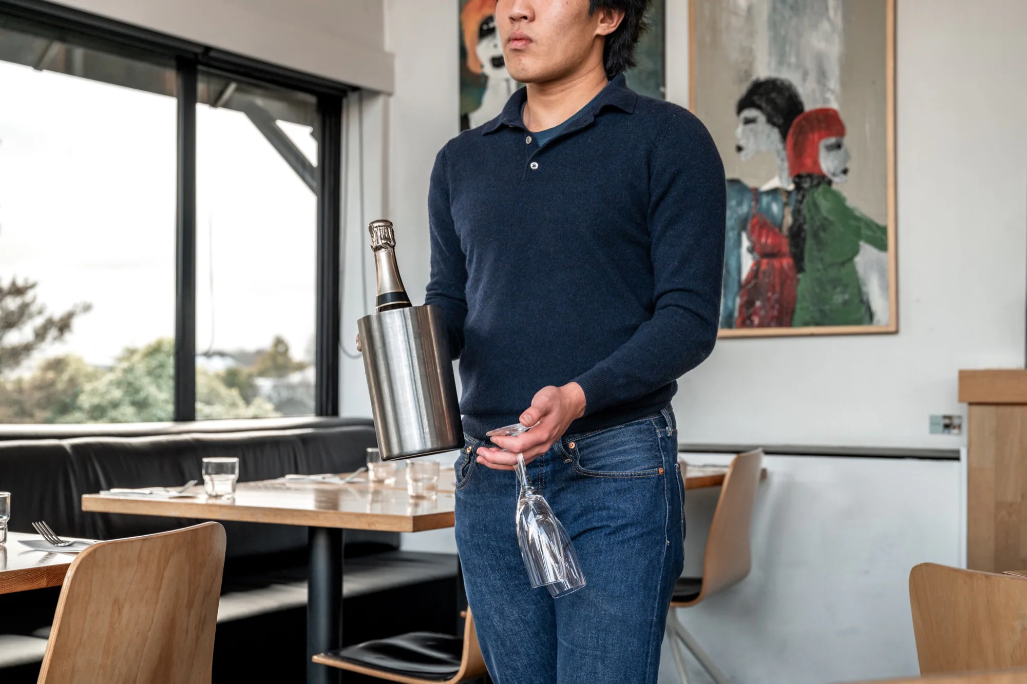
If a trades business says it handles complex work safely, can a prospective client see the team, equipment and conditions? If accommodation promises seclusion, can a guest understand the relationship between the building, access and landscape? If a maker talks about materials and durability, is there evidence of how the product is made and used? If a restaurant describes warm service, are the photographs all empty rooms and isolated plates?
Photography cannot make a weak offer succeed. It cannot repair confusing navigation, thin copy, slow pages or an unclear call to action. It can make a strong, particular business legible.
Generic images make specific businesses look interchangeable
There is a quick way to test an existing website image library:
Hide the name and logo. Could a direct competitor use every photograph without changing anything?
If the answer is yes, the images are probably illustrating a category rather than explaining the business.
A stock image of a smiling team can mean “friendly”. A close-up of tools can mean “practical”. A laptop beside a coffee can mean almost anything. These images are not necessarily false, but they carry little identifying information. They ask the viewer to accept a general mood where useful proof could have been offered.
This distinction is supported by Nielsen Norman Group’s eye-tracking guidance: people tend to pay attention to photographs that carry information and often overlook images used as visual filler. That is directional research, not a rule that every original photograph will perform well. An irrelevant custom image can be just as decorative as a stock one.
The useful question is not “Is this image ours?” It is “What can somebody learn from it?”
What useful website photography needs to show
A good brief usually contains six overlapping kinds of evidence. The balance changes by business, but omitting several of them makes a website feel thinner than the company it represents.
People
Customers want to know who will turn up, host them, make the product or take responsibility for the work. A formal portrait can identify somebody. Photographs of people concentrating, checking, explaining and collaborating reveal more: role, manner and competence.
The strongest people photographs do not require staff to become models. They give them a real task, put them in the correct environment and direct only what helps the frame remain clear.
Place
Place includes more than a wide exterior. It is the route to the entrance, the scale of the room, the view from a bed, the relationship between workshop and yard, the light at the time customers will arrive, and the physical details that make the setting recognisable.
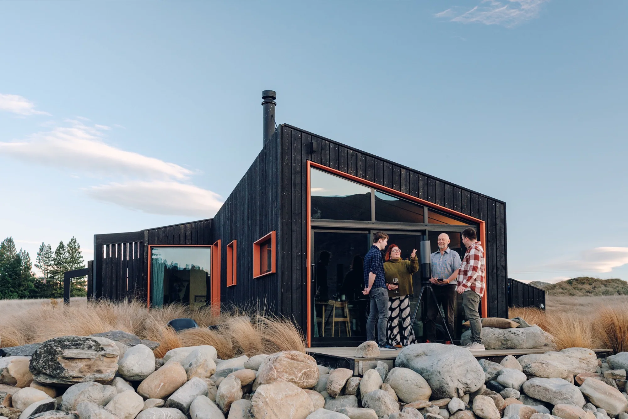
For an accommodation business, place may be central to the offer. For a manufacturer, it may be the evidence that the operation has the space and equipment to deliver. In both cases, geography has a practical job.
Process
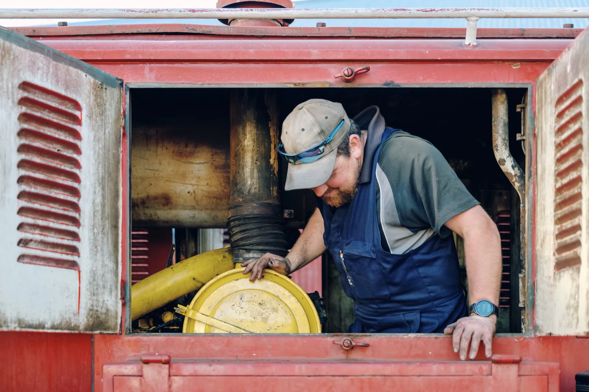
Claims such as handmade, carefully prepared, locally produced, thoroughly checked and safely installed become more convincing when the work is visible.
Process photography should not attempt to document every step. It should find the moments that explain what is difficult, what requires judgement and where standards are applied.
Proof and outcome
The finished meal, finished product, completed installation or prepared room matters. So do the signs of use around it.
An outcome shown without process can feel unsupported. Process shown without an outcome can leave the viewer wondering what the business actually delivers. A useful library connects the two.
Detail
Small details can carry a large amount of meaning: the condition of equipment, a material junction, the finish on an object, a place setting, a handwritten label, a stocked vehicle or the way a host has prepared for arrival.
Detail photographs work best as part of a sequence. Ten close-ups without an establishing frame can make a business feel atmospheric but impossible to understand.
Context
Context answers questions of scale, use and relationship. It shows a product in a hand rather than floating on white; a cabin occupied rather than perfectly untouched; a team inside the actual work environment; food as part of a table and an occasion.
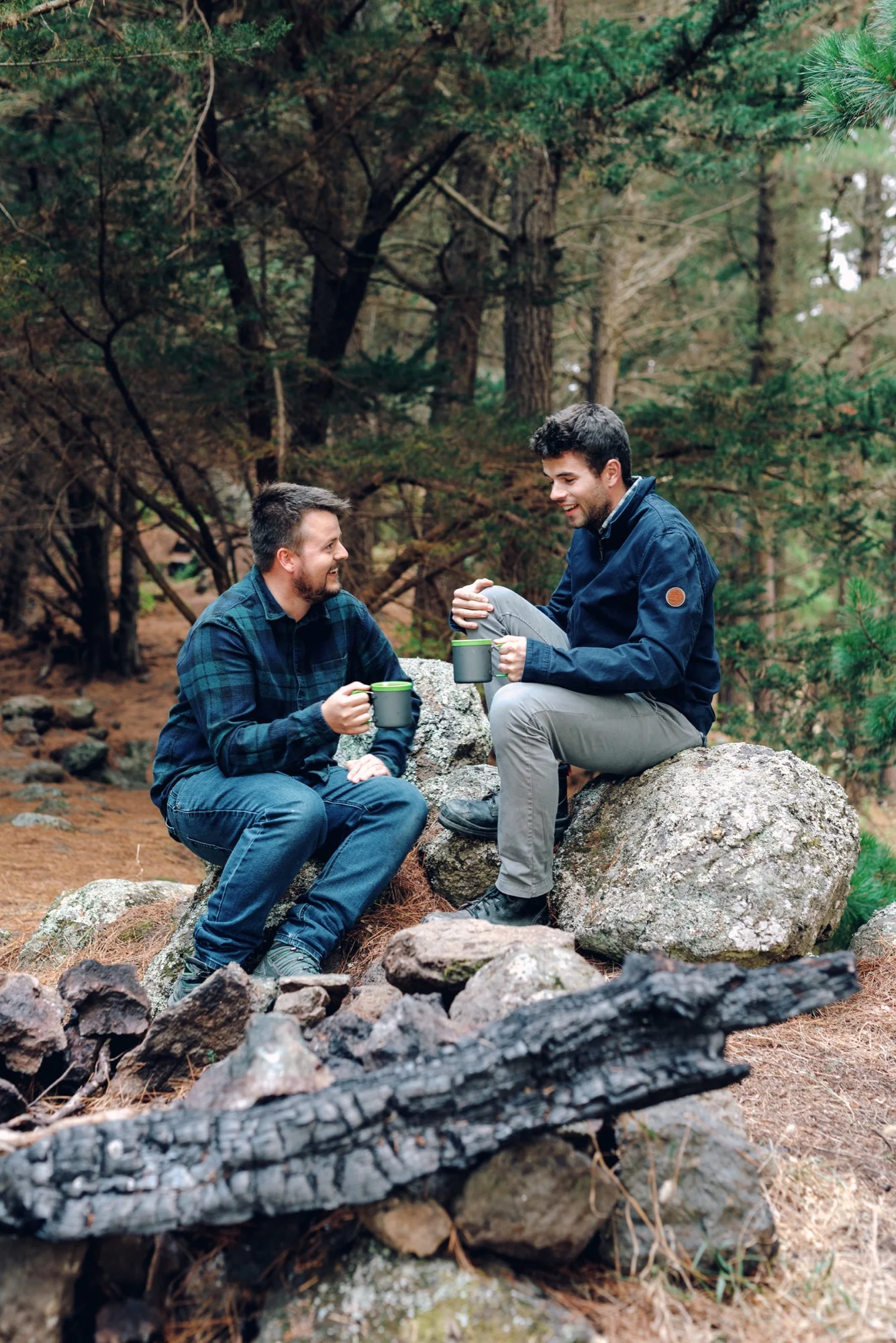
Context is where photography stops describing a thing and starts explaining why it matters.
Canterbury is not one postcard
“South Island business photography” can quickly become a style made from tussock, alpine light and rugged-looking people outdoors. That language is appropriate for some businesses. It is inaccurate for many others.
Canterbury’s economy spans agriculture, manufacturing, freight, tourism and export activity, as a recent Environment Canterbury summary of the regional economy makes clear. It also includes hospitality, professional services, construction, technology, retail, healthcare, education and a long tail of small specialist businesses. Much of that work happens in kitchens, offices, workshops, warehouses, suburban premises and urban streets.
Local specificity does not mean inserting a landmark or landscape into every set. It means noticing the conditions in which this business actually operates.
For a Christchurch restaurant, that might be the entrance from its particular street, winter coats on chairs or late light entering the dining room. The separate Field Note on why Christchurch restaurants need a sense of place goes further into that problem.
For a rural contractor, local truth might be dust, distance and the way machinery is prepared between jobs. For a city manufacturer, it could be a highly ordered production space that contradicts the rough visual clichés often applied to trades. For a destination stay, the landscape matters, but so do access, human scale, shelter and what guests can actually do once they arrive.
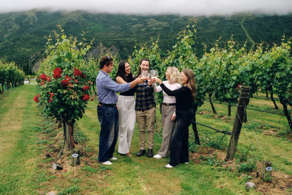
A local image is not one that announces the region most loudly. It is one that could only be made honestly around that business.
Plan images from pages and customer decisions
“We need 40 photographs” is not yet a brief. The number says nothing about whether the right questions will be answered.
Start with the website structure and assign a job to the images on each page.
Homepage
The homepage needs a fast, representative view of what the business is and who it is for. A hero image should carry identity at a large scale, but it also needs supporting frames that establish the range of work. One dramatic photograph cannot explain every service.
Ask what a new visitor must understand within the first minute. Then choose images that support those points rather than filling every available panel.
About page
An about page should make the people and operating character visible. It rarely needs a row of identical headshots alone.
Photograph the owner or team in situations that explain responsibility and expertise. Include enough environment to connect each person to the work. Make a clean portrait where it will be useful for press, proposals or profiles, then make less formal frames that show how the team actually interacts.
Service pages
Each service page should contain evidence specific to that service. Repeating the homepage hero beside four different descriptions weakens all four pages.
A useful service sequence can show the starting condition, the work being done, an important detail, the finished outcome and the people affected by it. That evidence changes across hospitality, accommodation, trades and industry and goods. The same principle applies inside any multi-service business.
Process and proof pages
Case studies, project pages, FAQs, capability statements and process pages need more than polished finals. Photograph the decisions and constraints that made the result possible.
These frames are easy to miss because they are not always the obvious portfolio favourites. They are often the most useful images for a customer comparing one provider with another.
Contact and location pages
Show enough of the exterior, entrance or reception to make arrival easier when customers visit. If the business travels to clients, show the working range honestly through projects rather than adding place names to unrelated captions.
A photograph beside a contact form can also set the expected tone of the first conversation. It should not create a different personality from the people who will answer.
Build a library, not one hero image
The hero receives disproportionate attention because it is large and immediately visible. A working website needs more range.
The same set of photographs may also be needed for Google Business Profile, tenders, proposals, recruitment, editorial requests, booking platforms, newsletters and announcements. That does not mean making one compromised frame for every channel. It means planning variations while the real people, place and activity are available.
A practical image library normally includes:
- wide establishing frames with room for headings;
- medium views that connect people to their environment;
- close details that support specific claims;
- horizontal and vertical versions of important scenes;
- photographs with different amounts of negative space;
- clear identification images and more observational sequences;
- enough alternatives that the same photograph does not appear on every page;
- a consistent edit so images made in different parts of the business still belong together.
The last point is important. More files do not automatically create more value. A hundred near-duplicates produce a selection problem. A smaller set with distinct roles can keep working for much longer.
One website can require several kinds of photography
A single South Island business may need architecture at first light, a staff portrait, machinery operating safely, a product detail under controlled light and customers using the finished service. Those are different photographic disciplines, production conditions and kinds of direction.
The uncommon part is not making one striking image. It is moving from exterior to portrait, from live work to a controlled product or food frame, and keeping all of it recognisably one business.
That requires the brief to start with use rather than genre. What does the website need to prove? Which activity cannot be interrupted? What must be controlled, and what should be allowed to happen? Which people need preparation? Which frames need clean space for design? Where will accurate colour or scale matter?
A documentary-rooted approach is useful here because it provides a consistent centre: observe how the business works, identify the meaningful evidence, then use light and direction to make that evidence clear. It does not mean every frame is candid. It means the production serves the truth of the business instead of replacing it with a generic campaign.
That is how Kerosene plans commercial image libraries across very different fields. The visual finish matters, but the library is judged by whether it remains useful once it reaches the website.
Delivery is part of the photography brief
A strong photograph can still be used badly.
Images should be sharp at their displayed size without forcing visitors to download unnecessarily large files. Important compositions need to survive wide desktop panels, narrower mobile screens and social previews. The focal point should not disappear when a design crops the frame.
Google’s image guidance recommends high-quality, relevant images near the text they support, responsive image handling and descriptive alt text. These are sound publishing practices. They do not mean adding a target phrase to every filename and description.
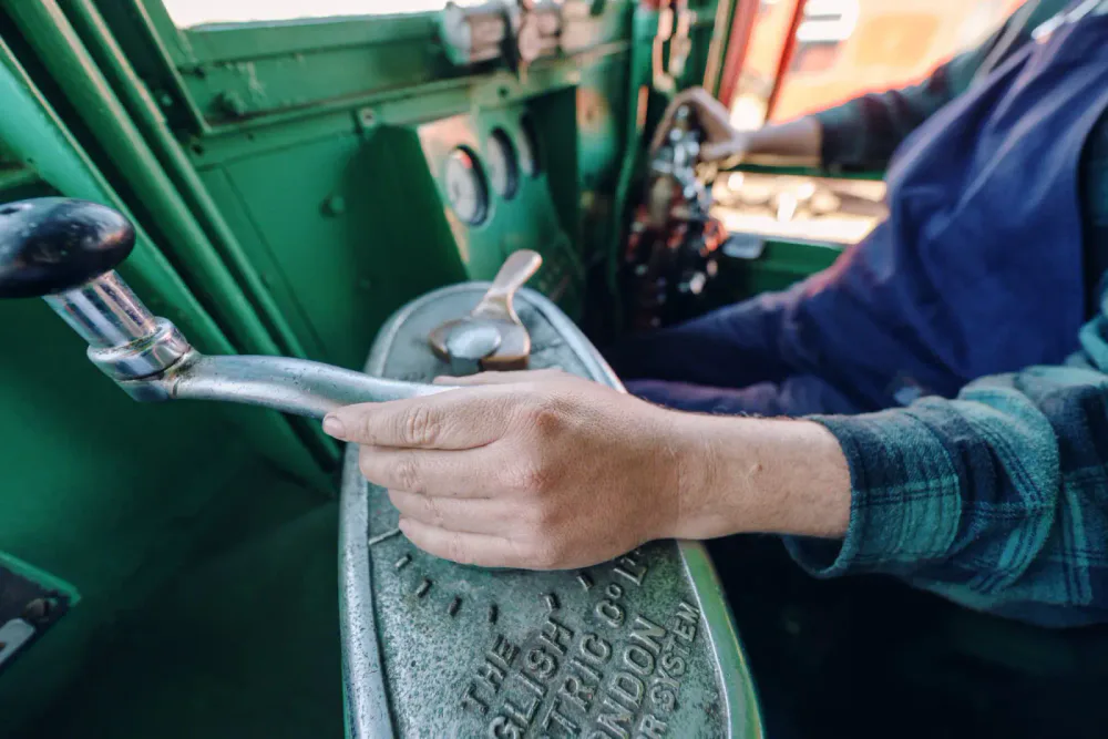
Alt text has an accessibility job. The W3C Web Accessibility Initiative advises describing the essential information in an informative image; a purely decorative image can have empty alt text. “Christchurch commercial photographer best business website photography” is not a description. “A railway workshop worker servicing machinery inside a red locomotive” is.
Before the shoot, the photographer and designer should agree on:
- the likely aspect ratios for hero, card, portrait and mobile placements;
- where copy will sit over or beside an image;
- which files need colour accuracy or enough resolution for close inspection;
- the final dimensions and compression workflow;
- filenames, captions and alt-text responsibility;
- usage rights for the website and the other planned channels;
- whether the content management system will create responsive versions.
That conversation prevents good work being weakened by accidental crops, slow-loading pages or improvised descriptions at launch.
A practical website-image audit
Open the website as if you have never heard of the business. Do not start by asking whether it looks good. Ask what the photographs let you know.
Identity
- If the logo disappeared, would the business still be recognisable?
- Do the photographs contain details competitors could not honestly claim?
- Is the visual tone consistent with the actual experience?
Evidence
- Can a visitor see the people, place, process and finished outcome?
- Are important claims supported by visible proof?
- Does each service have relevant imagery rather than a repeated generic set?
Customer questions
- Can a first-time visitor understand arrival, scale and setting?
- Can they tell who will do the work or host the experience?
- Are likely concerns—fit, safety, quality, comfort, materials or capability—addressed visually?
Range
- Is there more than one strong image doing all the work?
- Do the compositions function on desktop and mobile?
- Are there useful options for proposals, Google, press and future pages?
Publishing quality
- Are files sized appropriately for the page?
- Do informative images have accurate, concise alt text?
- Are captions used when context or attribution genuinely helps?
- Is every image there for a reason?
The audit will usually reveal one of three problems: missing evidence, weak specificity or poor implementation. Only the first two necessarily require new photography. Crops, selection, sequencing and file delivery can sometimes repair the third.
Specificity is more useful than volume
Website photography does not need to make a Canterbury business look larger, louder or more fashionable than it is. It should make the right qualities visible.
That might be a small team’s direct involvement. A piece of specialist equipment. A host’s attention to arrival. The relationship between a product and the terrain it was designed for. The rhythm of a working kitchen. A finish that only becomes meaningful at close range.
Those details differentiate because they are true and difficult to copy. They also give designers and writers something concrete to work with. The website becomes a coherent explanation rather than a layer of claims placed over interchangeable imagery.
If a competitor could use every photograph on your website, the next brief should not begin with a longer shot list. It should begin with the question the old images failed to answer:
What is specific here, and what would somebody need to see to believe it?
Kerosene creates commercial photography for hospitality, stays, trades and industry, and goods across Christchurch, Canterbury and the South Island. The process starts with where the images need to work and what they need to prove. If your website is underselling a good business, send the pages and the problem.